Processing math: 100%
Material on this page is copyright © 2020 John W.F. Waldron
Data in Structural Geology
Some of the equations (written in MathML) in these pages may not display correctly in some browsers; if you see strings of miscellaneous characters, try switching to a different browser.
Types of data and interpretation in structural geology
Structural geologists use many types of data. In earlier courses you have typically used small data sets - descriptions of rocks, strike-and-dip measurements of small numbers of surfaces, observations of single crystals in thin section.
In structural research projects it's common to work with large data sets. We employ computers to handle large amounts of data and do calculations in a fraction of the time that a human would take. However, it's important to know what the computer is doing. For this reason it's worthwhile to consider the types of data that are available, and the different ways of doing structural analysis.
Levels of interpretation
Data may be interpreted in 3 fundamentally different ways in structural geology.
Geometry
Geometry is concerned with the shapes and orientations of structures at the present-day. Geometrical observations include things like:
- Orientations of bedding and foliations
- Positions of fold hinges and faults
In many petroleum exploration projects, geometry is all-important; we need to find a dome or other closed structure in which oil or gas may have been trapped.
Kinematics
Distinguish geometry from kinematics - which is about how things have moved and changed shape. Kinematic observations include:
- How far did this fault slip?
- How much shortening occurred in the Rocky Mountain foothills?
Dynamics
Dynamics is about force, stress and energy.
- How much stress is acting on the San Andreas fault?
- What drives plate movements?
Data types
Qualitative data
Qualitative data can be expressed in words. Things like colour, rock classifications, the identifications of single minerals or fossil species are examples of qualitative data collected in geologic mapping. Sometimes, for speed or convenience, we use a qualitative scale for something that's actually quantitative. A common example is the grain-size scale used for describing sedimentary rocks.
Scalar data
Scalar quantities are those that can be represented by a single number expressing the magnitude of something (sometimes with an associated error). Grain-size, geologic age, density, are all examples of scalar quantities.
Mathematical operations applicable to scalar quantities are things like addition, subtraction, multiplication, and division.
Geochronologic ages are one of the most common scalar data types in tectonics. Typically ages are expressed in units of "meg-annum" or Ma, which means "millions of years before present". (Note that you don't need to say "ago" if you write "Ma". Note also that if you write about a time interval in the past, you should not use Ma. For example "the Silurian Period lasted only ~25 Myr, from ~444 Ma to ~419 Ma.)
Most geochronologic ages come with an associated error, resulting from the random nature of the radioactive decay of atoms, and the uncertainties of counting those atoms in a mass spectrometer. Often, that error is assessed by taking repeated measurements during an experiment to see how much they vary. The estimated age is derived from the mean of those measurements and the error is then expressed as a standard error of the mean. For example, an age might be given as 419 +/- 2 Ma (2σ). Note in this case the error is expressed as "2-sigma", meaning that it is double the standard error of the mean. The advantage of this is that if the errors are normally distributed (a "bell curve") then there is a 95% chance that the true age will lie between these limits.
Vectors
Vector quantities are those that have both magnitude and direction. For example, the velocity of movement of a plate, and the amount of slip on a fault are both vector quantities.
Vector quantities require two or three numbers for their description, depending on whether you are working in two or three dimensions.
Those numbers can be the magnitude and direction, or alternatively they can be two or three components parallel to chosen axes. In this course we will typically use axes that point east, north, and up, though other conventions are possible.
(a1a2a3)
If all the vectors in a data set point in almost the same direction, it's sometimes possible to treat vectors as scalars. For example, in a geophysical gravity survey, the differences in direction of gravity are tiny. The strength of gravitational force is thus usually measured as a scalar, measured in milligals.
There are a number of operations that can be performed on vectors. Vector addition can be achieved graphically by attaching arrows nose-to-tail or numerically by adding the corresponding components.
(a1a2a3)+(b1b2b3)=(a1+b1a2+b2a3+b3)
There are a couple of different ways of multiplying vectors: the vector dot product and the vector cross product, which can be used to calculate the angles between lines. If you do a linear algebra course you will be expected to learn these. We provide a formula sheet for carrying out these calculations.
Tensors
 Some quantities in geology are measured as vectors that vary in magnitude according to their direction in a very systematic way. One example is the state of stress in the Earth's crust. At any point within the Earth, the crust may be being squeezed in one direction while being stretched in another direction. Tensor quantities express this variation with direction. Graphically, a tensor can often be represented by an ellipsoid. Numerically, a tensor is represented by a square table of numbers, known as a matrix, representing vectors measured along chosen axes.
In two dimensional work, four numbers are needed to fill this matrix and so describe a tensor quantity. In three dimensions, nine numbers are needed for a 3x3 matrix.
Other examples of tensor quantities in geology are the optical indicatrix (for minerals whose refractive index varies with direction) and the strain ellipse and ellipsoid (which describes the way rocks have been distorted).
The only calculation that we require in this course is something called matrix multiplication. In matrix multiplication we work across the rows of the first matrix, and down the columns of the second matrix, multiplying pairs of numbers together and summing the results. Here's a 2D example.
(a11a12a21a22)(b11b12b21b22)=(a11b11+a12b21a11b21+a12b22a21b11+a22b21a21b12+a12b22)
We can also multiply a vector by a tensor in the same way, because the vector is just a matrix with only one column. This example is in 3 dimensions.
(a11a12a13a21a22a23a31a32a33)(b1b2b3)=(a11b1+a12b2+a13b3a21b1+a22b2+a23b3a31b1+a32b2+a33b3)
This multiplication can be used, for example, to predict the force concentration on any chosen plane, if the stress tensor is known.
Sometimes, this multiplication of a vector by a matrix produces a special result: a vector that has the same direction as the starting vector.
(a11a12a13a21a22a23a31a32a33)(b1b2b3)=k(b1b2b3)
Under these circumstances, vector b is called an eigenvector of the matrix, and the magnitude of k is called an eigenvalue. Most matrices have three solutions to this equation, so they have three eigenvectors. For a symmetric tensor like the stress tensor, these eigenvectors are always mutually perpendicular, and they correspond to the stress axes: the principal axes of the stress ellipsoid.
Finding the eigenvectors of a 3x3 matrix involves a lot of algebra. If you do a linear algebra course you will have to do it yourself; geologists are usually happy to use a computer program for this!
Lines and planes
The geometry of most geologic structures can be defined either by surfaces or lines or some combination of both. It's worth stating the methods we have for describing the orientation of lines and planes.
Linear features
Examples of linear features:
- Primary linear features: Current lineations (flutes, grooves), Flow lineation in lavas, clast long-axis orientation in tills.
- Secondary linear features: crenulation lineations, stretching lineations, fold hinges, intersection lineations, fault-bedding intersections (cut-off lines).
Polarity of Lines
Lines can be directional or non-directional (aka "axial").
- Directional lines have a polarity (e.g. paleoflow dirctions measured in sedimentology). For any given trend and plunge, the direction is typically specified as down or up plunge.
- Non-directional lines do not have a polarity (e.g. fold hinges).
Specifying the orientation of a line in the field
- Trend (000-360) and plunge (00-90). Trend is chosen to have the same sense as the 'down' direction of plunge. E.g. 345-67
- If the line is directional, we need to specify whether the 'flow' is down-plunge or up-plunge
Specifying the orientation of a line on a map
- On maps, lineation symbols are based on arrows
- A line on a map displays a long linear feature, that may be curving or straight.
- We can indicate the variation in depth of the line by placing points on the line at known elevation. The spacing of the points is related to the plunge:
- spacing = contour interval / tan(plunge)
Line on a stereographic projection
- On a stereographic projection a line is represented by a point.
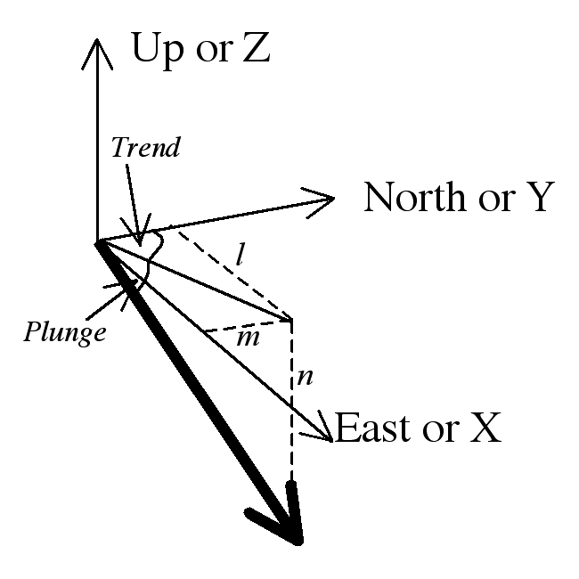
Lines as vectors
To do any kind of calculations with lines we need another type of representation.
- A better representation is as a unit vector (a vector of magnitude 1).
- Vectors are typically represented by bold letters: a; unit vectors (length one unit) are distinguished with a hat â. In hand-written text vectors are underlined a, â.
- A vector is usually described by three components, parallel to three axes
- We have to choose axes: we will use East, North, and Up as x, y and z axes. (Some textbooks use North, East, and Down).
- If the line is non-directional we arbitrarily choose the down-plunge direction.
- We label the components of this vector parallel to x,y, and z as l, m and n respectively.

- The vector components (l,m,n) of a line with plunge (P) and trend (T) are given by:
- l = sin T cos P
- m = cos T cos P
- n = -sin P
- The three components are also known as direction cosines because each is the cosine of the angle between the line and an axis.
Planar features
Examples of planar features
- Primary planar features: bedding surfaces, cross-stratification, flow banding surfaces.
- Secondary planar features: Fault surfaces, cleavage and foliation surfaces, fold axial surfaces, etc.
Polarity of Planes
Planes can also be directional or non-directional. (Non-directional planes are sometimes called "axial", )
- Directional planes have a 'way up,' like bedding planes.
- Non-directional planes are those that are the same on both sides, like cleavage planes.
Directional features are sometimes called "polar". Non-directional features are sometimes called "non-polar" or "axial". Beware, though, that "axial plane" means something else, in fold description.
Recording the orientations of planes in the field
- Several alternative methods are available. We use:
- Right-hand rule strike (00-360), Dip (00-90). Right-hand rule strike direction chosen so that dip is 90° clockwise from strike. Note that it's a good idea to record the compass point direction in field studies as a check, e.g.
227/32 (NW).
Recording the orientations of planes in map form
Traditional symbols are based on a line with a tick mark
Traditional dip symbols in Canadian geology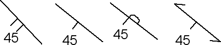
- Structure contours usefully represent planes that are present over a wide area of a map.
- Contour spacing indicates steepness of dip: tan(dip) = contour interval / spacing.
- Two non-parallel planes intersect in a line which can be plotted by intersecting corresponding structure contours
- Time-structure maps are much used in the petroleum industry when subsurface information is based on seismic reflection profiling. This is effectively starting with cross-sections and building a map. Often, the vertical scale on the profile is actually two-way-travel time, so when a contour map is drawn, the contours are labelled in seconds of two-way travel time (TWTT), not metres. To convert to depth, we need to know the seismic velocity, which is typically variable.
- depth = 0.5 x TWTT x velocity.
Planes on the stereographic projection
On a stereographic projection a plane can be represented either by either
- a great circle, or
- its pole
Planes as vectors
 A plane can also be represented as a unit vector with three components x, y, z or 1, 2, 3; we use the line perpendicular to the plane, known as the pole to the plane, to make a vector representation.
Statistics in structural geology and tectonics
Why do statistics?
In dealing with areas of complex deformation, it is common to collect very large amounts of orientation data. Most outcrops have lots of things to measure - multiple lineations, foliations, faults, etc.
Often, we want to take such data and answer questions like:
- "There seems to be a pattern in my measurements but it doesn't show well on the map:; how can I make it clearer?"
- "What is the average orientation of this lineation?"
- "Have I collected enough measurements to show that there is a pattern and not just a random mess?"
- "It looks as if there is a difference between the two halves of my map area; is it real?".
These questions require a statistical approach to orientation data. The answers are not always obvious.
There are four related objectives that we might have:
- Simplifying a large number of measurements graphically so that patterns are easier to see.
- Simplifying a large number of measurements numerically (e.g. by calculating a statistic like an average).
- Placing confidence limits on those statistics (especially if the number of measurements is small)
- Testing between alternatives.
In achieving these objectives we make use of some common statistical ideas. When we make predictions with statistics, we are often dealing with some of the following concepts:
- A sample is a small number of measurements that a geologist has taken in the field or lab. They could be scalar measurements, but more usually in structural geology we are dealing with vectors.
- Sample size n: the number of measurements.
- A population: the hypothetical nearly infinite number of possible measurements that could be made. We typically assume that our sample is drawn from the population by a random process.
- Confidence limits: How effective is our sample for characterizing the population? A confidence limit expresses the range within which the samples are likely to vary, given the sample size. Confidence limits are typically stated as a range of values, within which the true value is likely to occur 19 times out of 20. Larger samples produce smaller confidence limits.
- A null hypothesis: a hypothesis that allows us to make certain predictions about the results. Null hypotheses are often rather unexciting (e.g. the population is totally random, with no pattern). We can then compare the predicted results with the observations to see if they are likely. Often we hope to disprove the null hypothesis! (e.g. the population must show a pattern after all).
You may have met some of these ideas before if you have done a course in statistics. If so, you will probably have used only scalar data. However, in structural geology we deal with vector data often. These ideas are equally applicable, though the calculations are often more complicated and require a computer.
Statistics of scalar data - some examples from geochronology
Let's imagine that we have determined the age of 10 zircon grains that crystallized during solidification of a small granite intrusion, and another 50 from a sandstone. Examples of the various plots will be shown in the lectures.
Example 1
Graphics: For the granite, we expect them all to have about the same age, but there will be some scatter. If we plot the ages on a histogram, we would likely see some kind of bell-shaped distribution with a single peak, from which we could get an idea of the true age of the granite, and the amount of scatter or spread produced by both the geological and the laboratory processes.
Statistics: If we wanted to be more quantitative, we could calculate the mean and standard deviation of the ages, two statistics that are useful for describing a distribution with a single peak.
Confidence limits: Having done this, we could use the mean as an estimate of the true age of the granite, and we could use the spread to set confidence limits on that age.
Significance testing: Finally, suppose there was a larger pluton nearby, of known age. The two ages might be close, but are unlikely to be exactly the same. We could test the hypothesis that the two granites were actually the same age. Our null hypothesis would be that our sample of 10 zircons was drawn from a population with the same age as the larger pluton. With appropriate calculations, we would determine the probability that a sample would come out 1 Myr different from the true age. Based on this probability we could accept or reject the null hypothesis, and decide whether we have enough evidence for a difference in age.
Example 2
The results from the sandstone are likely to be quite different. In detrital geochronology it's common to see multiple age peaks in the sample distribution. We typically have to analyse a lot more grains to get useful information.
Graphics: A histogram is still a good way to represent the data, but there are other methods. We can draw a probability density plot. This is effectively the result of summing all the small bell curves, each one representing the age estimate and uncertainty of a single grain. Some statisticians have criticized this plot as being misleading when the analytical uncertainties are very variable. An alternative is a cumulative density plot. In this plot, the vertical axis represents the proportion of grains that are younger than the given age on the horizontal axis. It's effectively the integral of the probability density plot or the histogram.
Statistics: The mean age of a detrital data set is unlikely to mean anything usefu! Measures of the scatter might be more useful. More usually the minimum age is stated, because it sets a maximum depositional age for the sandstone. (The sandstone can't be older than the youngest zircon grain it contains.)
Confidence limits: Maximum depositional ages based on single grains are unreliable; the youngest grain might be a statistical outlier. It's more usual to base the maximum depositional age on the average of the youngest group of zircon grains with overlapping age uncertainties. It's then possible to state a confidence limit based on the errors associated with these grains.
Significance testing: A common question is whether two detrital samples could have come from the same source population. A useful test for this is the Kolmogorov-Smirnoff (or K-S) two-sample test. This uses the maximum difference between two cumulative curves to test whether two samples could have come from the same population.
Two-Dimensional data
Vectors
Vectors are critical for dealing with the data. For example, suppose we have a plane 001/89 and another 179/89. These two planes are only about 2° apart in orientation, both near vertical and striking north-south. But if we take a numerical average of the strike and the dip we get 090/89 which is clearly meaningless as an average. The trick here is that orientations are vector quantities and not scalars. They have to be added using the rules of vector addition. Both lines and planes are typically represented by unit vectors.
Circular plots for orientation data in 2 dimensions
2-dimensional data are those where only an azimuth is measured, e.g.
- paleoflow in an area of subhorizontal strata;
- fractures in an area where all the fractures are vertical.
Binning the data into classes with width 10°, 15° or 30° is often helpful: e.g.
- 000-029,
- 030-059,
- 060-089,
- etc.
We could use a conventional bar chart or histogram, but this has the disadvantage that it separates data that are close together (e.g. 359° and 001°)
Rose diagram
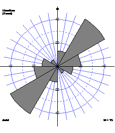
 Rose diagram consists of wedges with lengths proportional to number of data, spanning angles representing the classes.
For non-directional data, it is conventional to duplicate each wedge on opposite sides of the rose diagram producing a 'bow tie' shape.
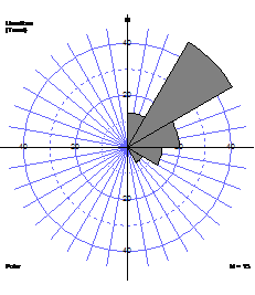
Circular histogram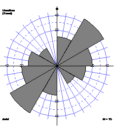
Some statisticians argue that it is more representative to make the areas of the wedges proportional to the number of data. Their lengths are then proportional to the square root of the number of data.
Statistics for polar data (Fisher statistics)
Statistics for directional data are typically calculated by vector algebra. These are sometimes called Fisher statistics after a pioneer of statistics in orientation data. Fisher statistics work well in 2D or 3D.
Vector sum and vector mean
How do we calculate the 'average' orientation for a data set? Treating the orientation data as unit vectors, we use vector addition to find a vector sum. To add vectors graphically, draw them nose to tail as in the diagram below.
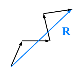
R=(â1+â2+â3+...... ân)
To add vectors numerically, add up all the l, m and n components separately to get the components of the summed vector.
R=(∑l∑m∑n)
(for more information on vector operations go here.)
The orientation of the vector sum R gives us an indication of the average orientation.
If we divide R by the number of measurements, we get the vector mean, represented by bold little r or by "R-bar"
r=ˉR=R/n
Measuring spread
The Resultant is the magnitude of R, sometimes called, and written |R| or just R. It gives an indication of how tightly clustered the vectors are. If all the n unit vectors point in the same direction then R = n. If the n unit vectors point in random directions then R << n
We can show that it gives a measure or spread that is independent of sample size by dividing it by n.
The mean resultant r is a "normalized" R.
r = R/n
It's also the magnitude of the vector mean r = |r|
If the n individual unit vectors were identically oriented then r = 1. If the unit vectors were completely scattered then r would be near zero.
Thus the mean resultant is an indication of the concentration of the distribution. A value close to 1 indicates highly non-random data; a value close to zero indicates data spread out.
The circular variance is a measure of the spread of the data. Circular (or spherical) variance S = 1-r
(All these statistics work well for two and three-dimensional data.)
Statistics with non-polar data
Non-polar data cannot easily be treated as vectors, because there is nothing to distinguish one 'end' of the line from the other. The solution to this problem depends on whether you are dealing with 2D or 3D data.
In two dimensions, non-directional data are measured from 000 to 180°. A measurement of 179° is very close to one of 001°. This suggests a solution to the problem of statistical analysis - double all the angles! Simply calculate the statistics with the doubled data, and then halve the angles to get the mean direction, etc. It turns out that this method works well and is statistically valid.
Confidence limits
Typically it's possible to set confidence limits on statistics such as the vector mean. The calculations themselves are beyond the scope of this course but are routinely carried out by computer programs used to calculate the statistics themselves.
Statistical testing
A large number of statistical test for significance and confidence have been proposed. We will look at just one, the Rayleigh test for uniformity using a single sample
Suppose we have a set of n measurements, which show a loose cluster, and we want to know whether the clustering could have arisen by chance, by random sampling from a 'population' that had no pattern. This is an example of what statisticians call a one-sample test.
We form a null hypothesis: The sample arose by random sampling from a uniform distribution. (A uniform distribution plots as an even density of points all over an equal-area projection.)
We can then mathematically determine the chance of getting a value of r as high as that observed, if the null hypothesis were true. If this chance is low (typically if it is less than 5% or alpha a =0.05) then we reject the null hypothesis as unlikely. Then we accept the alternative hypothesis that there is a pattern or clustering to the distribution.
The test is usually carried out by comparing the observed r with critical values in tables, e.g. by Mardia (1972; appendix 2.5 for 2 dimensions).
Three-dimensional data
3-D data are those where both an azimuth and an inclination are measured.
Stereographic plotting in 3 dimensions
Stereographic and equal area projections
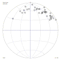
Spherical priojections are ideal for 3-D data. For most purposes, we use the equal-area projection. For any process that requires a subjective best-fit of a point or line through densely clustered data, it is essential to use the equal area projection (Schmidt net) so that the estimate of density will not be biased.
Some types of distributions: Two end-member types of distribution are recognized. One is the cluster. A cluster is a symmetric, roughly circular group of data points scattered around a single direction. In contast, a girdle appears as a band of measurements on the stereographic projection, scattered on either side of a great circle. Between these extremes, it's common to find intermediate cases: girdle distributions that contain a high-density cluster, or clusters that are drawn out some distance into a girdle. All these are common when field data are plotted from areas of folded rocks.
Contoured plots can help to show patterns in the data, and distinguish them from random 'noise'.
Typically the contours are numbered with values of concentration: for example, areas inside the '2' contour have more than 2% of the data points per 1% of the area of the net.
There are a number of different contouring methods which vary in the amount of smoothing that they apply.
Hand contouring is described in detail in EAS 233. Contouring by hand gives a good appreciation of the contouring process. However, it can be tedious, and for small data sets, the fixed size of the contour circle is a limitation. Also, in small data sets a single data point can show up as a bulls-eye contour, producing unwarranted 'fussiness' in the contour pattern.
Computer contouring: To offset this problem several solutions are proposed, by adjusting the size of the contour circle, or by making its edges 'fuzzy'. These methods require far to much calculation to be done by hand but can be done easily with computer software. The most common method is called 'Gaussian'. In the Gaussian method, the sharp edges of the contour circle are replaced with a gradual decline in the contribution of each point to the contoured density. The actual decline is determined by a distribution called a spherical Gaussian distribution - a 3-D version of the famous 'bell-curve'. This can effectively remove the sharp edge effects resulting from the contouring circle approach.
Statistical measures of orientation fpr polar data
The same statistics - vector sum, vector mean, resultant, and mean resultant, are available for 3-dimensional data if those data are polar.
Eigenvector method for 3-dimensional data
Bingham statistics
For non-polar data in 3 dimensions we have to adopt a new method of calculating average directions and statistical tests, based on matrices rather than vectors. These methods are called Bingham statistics after their inventor.
Moment of inertia from physics is an analogy.
Imagine each of the poles on the net is a 1 gram weight on the surface of a sphere. Try to spin the sphere. This will be easiest when the axis is as close as possible to as many of the weights as possible: the moment of inertia is low, and the weights are symmetrically distributed on either side of the axis. This is the average orientation.
Spinning the sphere will be hardest when the axis is as far as possible from as many of the weights as possible: the moment of inertia is high; the weights are again symmetrically distributed on either side of the axis. The maximum moment is always 90° away from the minimum. If the points are on a "girdle" distribution this will be the pole to the girdle, another useful orientation for structural geologists.
Direction cosine matrix:
How are these axes obtained? Normally this has to be done by computer. First a matrix of sums direction cosine products is prepared
(∑l2∑lm∑ln∑lm∑m2∑mn∑ln∑mn∑n2)
Eigenvectors: For symmetric matrices such as this one, it is possible to define three special, mutually perpendicular directions, called eigenvectors 1, 2, and 3 and three corresponding numbers, called eigenvalues that are important properties of the matrix.
One eigenvector corresponds to the largest moment of inertia and the smallest concentration of points. It estimates the pole to the best-fit girdle. Another eigenvector corresponds to the smallest moment and estimates the centre of the densest cluster, similar to a mean direction. Notice that an intermediate eigenvector corresponds to the emptiest part of the best-fit girdle.
Eigenvectors of a distribution of poles
Three eigenvalues are inversely related to the moments of intertia, and are numbered so that e1<e2<e3. They give an indication of the type of concentration in the distribution. If e1=e2<<e3 then the distribution is a pure cluster. If e1<<e2=e3 then the distribution is a pure girdle. For the above distribution, the values are:
e1 = 0.86 e2 = 14.6 e3 = 19.6
indicating a distribution with mainly girdle characteristics. Notice that the three eigenvalues add up to the total number of points n. (In some computer programs, the eigenvalues are 'normalized' by dividing by n; in that case the sum of the eigenvalues will be 1.0)
As with vector data, the usefulness of eigenvector analysis depends on the type of distribution you are trying to describe. Ideally, eigenvector-based statistics are most applicable to a special type of distribution called a Bingham distribution. Distributions of poles to folded surfaces, and of linear markers in homogeneously distorted rocks, often correspond quite closely to Bingham distributions. Other geological situations (refolded folds, crystal c-axes in dynamically recrystallized rocks) may produce more complex distributions which cannot be described by eigenvectors.
Confidence limits
Cone of confidence on the mean
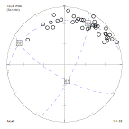
When there is a clear cluster of directional data, we can use the direction of the vector sum as an indication of the average direction. But if the sample is small, how reliable is it? Statisticians are able to calculate a 'cone of confidence' about the mean direction of a sample - a small circle within which the true mean of the sampled population of structures is expected to lie.
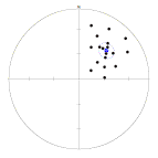
Plot of 18 points with mean and cone of confidence.
Calculating cones of confidence by hand is tedious. In the labs we will use a program Orient to calculate cones of confidence.
Caution: the cone of confidence is a 'parametric' statistic. This means that the calculation is only really valid for samples drawn from a particular distribution, in this case a form of cluster called a Fisher distribution. If the distribution of points on the net is not a reasonably simple cluster, do not place too much credence in the cone of confidence!
Cone of confidence on the eigenvectors
For non-directional data, and any data that are spread out on a "girdle" distribution, we typically use Bingham statistics. The computer programs that calculate eigenvectors and values typically can calculate cones of confidence about the eigenvectors too. Note that these cones are not circular. but elliptical.
Statistical testing: Simple test for difference between two samples
More often in geological problems a two-sample test is needed. A geologist will want to know if two samples significantly different from one another.
The null-hypothesis in this case will be: Both samples arose by random sampling of the same distribution.
The concept of cone of confidence leads to a simple test to address this null hypothesis and test for the equivalence of two clustered data sets.
Calculate a mean and cone of confidence for each data set. If the mean of one data set lies outside the cone of confidence for the other, you can be reasonably (95%) sure that they do not represent two samples drawn from the same population, and the null hypothesis can be rejected. Note that this test will potentially detect any kind of difference between the two data sets; either a difference in the orientation or a difference in the amount of scatter may lead to rejection of the null hypothesis. Think carefully about the geologic implications if the cones of confidence you are comparing have very different sizes!
Reference
Mardia, K.V., 1972. Statistics of Directional Data. Academic Press, London.